Page 1 of 1
iOS App Redesign
Posted: Sat May 30, 2015 4:02 am
by ajc88uk
Re: iOS App Redesign
Posted: Mon Jun 01, 2015 12:03 pm
by Shawn.S@AST
Hi Ajc88uk,
We have read all the post and did pay attention to them. For the iOS version, we are working on them day after day but because iOS 8 has significant changes so we need to change all the software modules and that is the reason why we lag behind in the iOS app refreshing because we need to make the function work first.
We will release the new look Aimaster first in a month or so and then the others apps will be updated soon. Please kindly stay tuned.
Re: iOS App Redesign
Posted: Mon Jun 01, 2015 12:14 pm
by vesperdose
Shawn.S@AST wrote:We will release the new look Aimaster first in a month or so and then the others apps will be updated soon. Please kindly stay tuned.
we are looking forward to it
Re: iOS App Redesign
Posted: Wed Jun 21, 2017 7:28 am
by raidsm
AiDATA still look like an old 2008 app on iOS!... but other where updated, great job. Still waiting for aidata thought
Re: iOS App Redesign
Posted: Tue Feb 19, 2019 8:37 pm
by WisTech
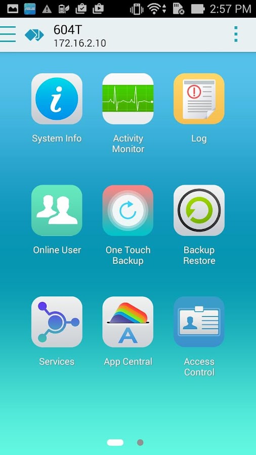
Most probably, Flat icon style is the most attractive. Well, this is what I think and have seen peoples use flat design icons.
Re: iOS App Redesign
Posted: Fri Apr 19, 2019 7:31 pm
by UserAbuser
Most probably, Flat icon style is the most attractive
Totally agree